A Bar Chart of Population Data
In this section we will make a more elaborate data-based visualisation: A bar chart of the population of the municipalities of Overijssel province. We will start by looking at some D3 code that creates a simple bar chart from data that is included in the code, in the same way you did in the previous section.
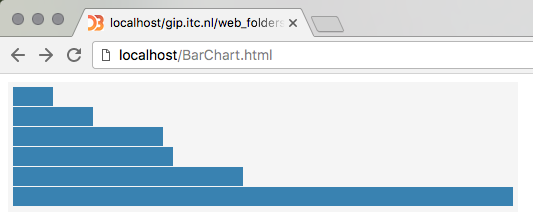
The page in the figure above is made by the code in Listing 8. Study the code carefully, try to understand how it works: How the data is used to set the position of the bars, their width, and so on...
|
1 2 3 4 5 6 7 8 9 10 11 12 13 14 15 16 17 18 19 20 21 22 23 24 25 26 27 28 29 30 31 32 33 34 35 36 37 38 39 40 41 42 43 44 |
<!DOCTYPE html> <html lang="en"> <head> <meta charset="UTF-8"> <script src="lib/d3.js"></script> <!--CSS styling for bar chart elements:--> <style> .chart { background-color: rgb(245, 245, 245); padding: 5px; } .chart rect { fill: steelblue; } .chart text { fill: white; font: 9px sans-serif; text-anchor: end; } </style> </head> <body> <svg class="chart"></svg> <script type="text/javascript"> let data = [4, 8, 15, 16, 23, 50]; const svgwidth = 500; const barHeight = 20; const svgheight = barHeight * data.length; const xScale = 10; let chart = d3.select("svg") .attr("width", svgwidth) .attr("height", svgheight) ; let bar = chart.selectAll("g") .data(data).enter().append("g") .attr("transform", function (d, i) {return "translate(0," + i * barHeight + ")" }) ; bar.append("rect") .attr("width", function (d,i) { return xScale * d }) .attr("height", barHeight - 1) ; </script> </body> </html> |
Some elements we have not seen before are:
- the code at the top (in the
<style>tag). This is using the CSS or Cascading Style Sheets language. We will not go into details on CSS in this exercise, suffice to say that it sets the styling of the elements of thechartclass, which is the CSS class used in creating thesvgelement in line 23. - the
append("g")andappend("rect")methods in lines 35 and 38; These, not surprisingly, creategandrectelements, i.e. groups and rectangles, in the same way we created circles earlier; We use aselectAll + data + enter + appendchain to create a set ofgroups, that each hold arectangle; - the
transformattribute in line 36. This applies to a (group of) element(s): the content of thetransformstring sets the actual transformation: In this case atranslate(other possibilities arerotateandscale). The transform is used to draw each bar at a different position, by translating along the y-axis based on the dataindex.
Create a new webpage called BarChart.html using listing 5. Experiment with changing
key numbers (such as the xScale constant) and other parts of the code to see how it influences
the visualisation.
Using D3's data-dependent scaling
A weakness of the code above is the use of the arbitrary number 10 to set the xScale. We use it
to scale the width of the bars, depending on the data value. The value of this number should depend on the domain
of the data (the minimum and maximum value, in this case 0 and 50 respectively), in relation with the desired width
of the chart (500px = the svg width). But of course these dependencies are only implicitly defined in the value 10, and
if the data changes, this number should also be changed. That's not what we want...
We can make these dependencies explicit and eliminate the "fixed" number by using a linear scale, dependent
on the actual data. D3's scaleLinear() function specifies a linear mapping from data space
(domain) to display space (range):
|
24 25 26 27 28 29 30 31 32 33 34 35 36 37 38 39 40 41 42 43 44 |
<script type="text/javascript"> let data = [4, 8, 15, 16, 23, 50]; const svgwidth = 500; const barHeight = 20; const svgheight = barHeight * data.length; const xScale = d3.scaleLinear() .domain([0, d3.max(data)]) .range([0, svgwidth]) ; let chart = d3.select("svg") .attr("width", svgwidth) .attr("height", svgheight) ; let bar = chart.selectAll("g") .data(data).enter().append("g") .attr("transform", function (d, i) {return "translate(0," + i * barHeight + ")" }) ; bar.append("rect") .attr("width", function (d,i) {return xScale(d)}) .attr("height", barHeight - 1) ; |
Although xScale as before looks like a constant, it is now actually a function:
For any given data value in the domain (which in line 30 is set as an array from 0 to the maximum value
found in the data), the function returns a scaled display value in the range (which in line 31 is
set between 0 and the width of the svg. For example, an input value of 4 returns 40, and an input value of 16 returns 160.
To use the new scale, simply replace the hard-coded multiplication (xScale * d) by a call
to the xScale() function in the appropriate location (line 42).
To understand how this makes scaling flexible, implement the changes mentioned above and experiment
with changing the width of the SVG by changing the number in line 26
var svgwidth = 500 and/or the data values in line 25.
Notice how the chart adapts to the width available...
D3 scales can also be used to interpolate many other types of display-space values, such as paths, color spaces and geographic transforms, as we will see later.
Adding an Axis
The next task is to enhance the chart's usability by adding a value axis. Below we mention the building blocks needed, you should figure out yourself where these should be placed, what values to use, and to test the results in your browser. The final chart should look like the figure below. The solution will appear in due time in the Solution Listing at the end of this page...
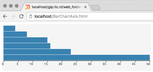
D3 has a powerful mechanism to add axes to graphs, charts and maps. You define an axis by telling d3 to create
an axis function: const theAxis = d3.axisBottom(xScale);
The parameter you provide to this function is the d3.scale() it should use to determine the
values. If your axis should appear below the chart, you use the axisBottom(scale) function (the
other possibilities are, not surprisingly, axisTop, axisLeft and axisRight).
The resulting object (here named theAxis) can be used to render multiple axes by repeated application using selection.call(). Think of it as a rubber stamp which can print out axes wherever they are needed. The axis elements are positioned relative to a local origin, so to transform into the desired position we need set the "transform" attribute on a containing element. Often we use the general SVG grouping element "g" for this:
<someElement>.append("g")
  .attr("class", "axis")
  .attr("transform", "translate(x, y)"
  .call(theAxis);
The axis container should also have a class name so that we can apply styles. The class name "axis" is arbitrary; call it whatever you like.
The axis component that d3 will create consists of a path element which displays the domain, and multiple .line elements for each tick mark. A tick in turn contains a text label. Most of d3's examples therefore use the following minimal style in CSS:
.axis text {
  font: 9px sans-serif;
  fill: black;
  }
.axis path,
  .axis line {
  fill: none;
  stroke: black;
  }
You will also need to make room for the axis below the graph. To do that, you'll have to make the
svg height bigger then the height needed for the chart bars alone!