Bar Chart created by a Python webservice
In this section you will learn how to add a Bar Chart that is being created by a webservice. You will create this webservice yourself, using a Python CGI script that creates a graphic using MatPlotLib
This assumes you have experience with using Python MatplotLib, as well as creating webservices using Python CGI script. These skills you should have acquired in earlier Python Exercises (e.g. in the Scientific Geocomputing course) and in the web exercises: In those exercises you should also have created a services folder inside in the root of your personal, web accessible, folder in the server. If not, make sure to do so now.
Getting the data
For the actual graph we have four decisions to make: 1) Which data will be used in the graph? 2) what is the appropriate type of graph? 3) what is the mechanism to generate it? and 4) what service do we use to get the data? For the purpose of thise simple exercise, we have chosen to display population data aggregated per province for which we have one discrete variable, provinces, and one value variable, number of inhabitants. This means that one of our options is a bar chart. We will generate the actual bar chart using Python MatPlotLib.
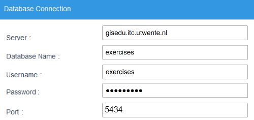
For the data, we will use the same database we have used before in the Mapserver WMS exercises: The "world" schema of the PostGIS "exercises" database on the server gisedu.itc.utwente.nl.
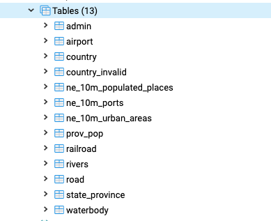
We will use the prov_pop table, which holds population data per province for all countries. To generate the desired data, we first need to write an SQL query. The listing below shows the SQL we will use to extract population figures for the provinces of The Netherlands. The best way to understand what is happening is to run it -- simply open a query window in pgAdmin4 and then paste and execute the query.
|
1 2 3 4 |
SELECT admin_name, pop_admin FROM world.prov_pop WHERE cntry_name = 'Netherlands' ORDER BY pop_admin DESC; |
Now we can create a Python CGI script that will extract the data from the database using this query. To generate the service script, create a file pop_db.py using the listing below, and place the script in the services/ subdirectory that you created earlier.
|
1 2 3 4 5 6 7 8 9 10 11 12 13 14 15 16 17 18 19 20 21 22 23 24 |
import cgi, cgitb cgitb.enable() import psycopg2 ############# Block 1: Get Data ################ # connect to the db db = psycopg2.connect("host='gisedu.itc.utwente.nl' port='5434' \ dbname='exercises' user='exercises' password='exercises'") # Get a cursor dbcursor = db.cursor() #create and execute query SQL = """SELECT admin_name, pop_admin FROM world.prov_pop WHERE cntry_name = 'Netherlands' ORDER BY pop_admin DESC;""" dbcursor.execute(SQL) data = dbcursor.fetchall() ############ write to Response Object ################ # first we need to output http header: print ('Content-type: text/plain') print ('') # this empty print is required! # simply output the data Dict print (data) |
Test the service using the URL below. If the service does not behave as expected, revisit the code snippets to solve the problem.
Population Service URL:
https://gisedu.itc.utwente.nl/student/<<SNUMBER>>/services/pop_db.py
Plotting a graph
For the graph, we will use Python's MatPlotLib to plot the data as a bar graph. We will not focus on the actual code much here, bust just re-use the code you used in earlier MatPlotLib exercises. Add the highlighted lines in the listing below to the code:
|
1 2 3 4 5 6 7 8 9 10 11 12 13 14 15 16 17 18 19 20 21 22 23 24 25 26 27 28 29 30 31 32 33 34 35 36 37 38 39 40 41 42 43 44 45 46 |
import cgi, cgitb cgitb.enable() import psycopg2 import matplotlib.pyplot as plt ############# Block 1: Get Data ################ # connect to the db db = psycopg2.connect("host='gisedu.itc.utwente.nl' port='5434' \ dbname='exercises' user='exercises' password='exercises'") # Get a cursor dbcursor = db.cursor() #create and execute query SQL = """SELECT admin_name, pop_admin FROM world.prov_pop WHERE cntry_name = 'Netherlands' ORDER BY pop_admin DESC;""" dbcursor.execute(SQL) data = dbcursor.fetchall() ############# Block 2: create figure ################ labellist = [] valuelist = [] # extract the lists from the Dict: for item in data: labellist.append(item[0]) valuelist.append(item[1]) # Create a matplotlib figure plt.figure(figsize=(10,4)) fig = plt.subplot() indices = range(len(labellist)) fig.bar(indices, valuelist) fig.ticklabel_format(style='plain') #avoid scientific notation fig.set_ylabel('Population') fig.set_xticks(indices) fig.set_xticklabels(labellist) fig.tick_params(axis='x', rotation=90) plt.subplots_adjust(bottom=0.3) # make room for labels ############ write to Response Object ################ # first we need to output http header: print ('Content-type: text/plain') print ('') # this empty print is required! # use plt.show() to plot the chart? print(plt.show()) |
If you now (re)load the service, you maybe expected to see a barchart, but you will be dissapointed... The browser will most likely be stuck, forever waiting for a valid response from the server to display. The problem is the command you normally use to plot your chart in stand-alone python scripts: plt.show(). If you would run this python script in PyCharm or on the command-line of your computer, it will work: MatPlotLib will put the figure as a picture in the output console of your Python interpreter. But because our script is running on the server, there is no output console! We have to make sure the output is delivered to the CGI Response object...
In Python CGI, the Response object can be accessed by simply using print(), so you might be tempted to just try print(plt.show()), but it's a bit more complicated than that. The reason is that print() can only handle Strings and string-like objects (such as arrays or dicts of Strings, or JSON).
Instead, we will create the graph as a drawing, and use the matplotlib plt.savefig() command. We do not actually save the drawing to the computer's file system, but instead to sys.stdout.buffer, which in CGI python is where the Response object is created from (and where print() also puts its output in). The listing below shows the added/changed code in the highlighted lines. Now you should be able to test the service, and get an SVG graphic as a result in your browser...
|
1 2 3 4 5 6 7 8 9 10 11 12 13 14 15 16 17 18 19 20 21 22 23 24 25 26 27 28 29 30 31 32 33 34 35 36 37 38 39 40 41 42 43 44 45 46 47 48 49 50 |
import cgi, cgitb cgitb.enable() import psycopg2 import matplotlib.pyplot as plt import sys ############# Block 1: Get Data ################ # connect to the db db = psycopg2.connect("host='gisedu.itc.utwente.nl' port='5434' \ dbname='exercises' user='exercises' password='exercises'") # Get a cursor dbcursor = db.cursor() #create and execute query SQL = """SELECT admin_name, pop_admin FROM world.prov_pop WHERE cntry_name = 'Netherlands' ORDER BY pop_admin DESC;""" dbcursor.execute(SQL) data = dbcursor.fetchall() ############# Block 2: create figure ################ labellist = [] valuelist = [] # extract the lists from the Dict: for item in data: labellist.append(item[0]) valuelist.append(item[1]) # Create a matplotlib figure plt.figure(figsize=(10,4)) fig = plt.subplot() indices = range(len(labellist)) fig.bar(indices, valuelist) fig.ticklabel_format(style='plain') #avoid scientific notation fig.set_ylabel('Population') fig.set_xticks(indices) fig.set_xticklabels(labellist) fig.tick_params(axis='x', rotation=90) plt.subplots_adjust(bottom=0.3) # make room for labels ############# write as SVG to CGI Response Object ################ # first we need to output http header for an SVG web graphic: print ('Content-type: image/svg+xml') print ('') # this empty print is required! # we cannot use simple plt.show() because that plots to the screen # so we use plt.savefig() to save as a SVG drawing, # but we do not save as a file, but to the sys.stdout buffer, # which in CGI python writes to the Response Object! plt.savefig(sys.stdout.buffer, format='svg') |
MatPlotLib can save figures in a great many formats, depending also on the backend that is used by your Python installation. For an overview, see the matplotlib API documentation. The default is usually a PNG raster file. But as we are creating web content, we prefer to use SVG (Scalable Vector Graphics), the HTML5 standardised vector format.
Consuming the graph service
Now we can include the service-generated barchart in our web page. Edit the HTML file data-viewer.html you have created before in the exercises. Change the line highlighted in the listing below to make
the src of the img now point to the Python service your created. If you now reload the page it should have the bar-chart included, as shown in the figure below. Note that it sometimes takes a while before the service has created and delivered the picture and the chart is shown...
|
1 2 3 4 5 6 7 8 9 10 11 12 13 14 |
dotdotdot <!-- Chart Section --> <section class="one-column"> <article id="bar_chart"> <h2>Bar Chart</h2> <div id="chart_container"> <img id="population_chart" src="../services/pop_bars_svg.py"> </div> </article> <!-- bar_chart --> <br class="clear"/> </section> dotdotdot |
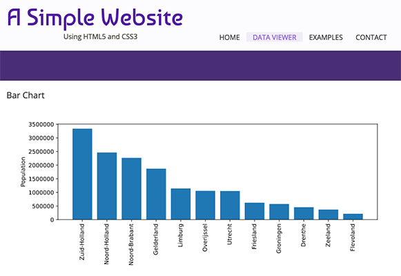
This exercise might seem trivial and useless: You now have the same bar chart that you had earlier in your webpage! But remember this one is now dynamically generated from the database, instead of showing a static image. That means whenever the data (source) changes, the chart will change!
Try to make changes in your code that result in showing the population chart of the provinces of for example Canada (or you home country) to show, instead of those of the Netherlands.