Adding Style
Remember that the browser reads the HTML code sequentially and renders the content accordingly. This means, if you load the page in the browser as it is now, the existing content will simply render one after (and in this case: below) the other as it is in the HTML file. We will now take control of how elements are rendered in the page, and what their behaviour and look should be, by specifying a set of styles via CSS selectors. CSS selectors are pieces of code that specify the presentation of specific elements of a page.
By default browsers apply pre-defined style definitions to most HTML elements, and that holds true for the elements in our page. If you open the contents in your browser you can clearly see the distinction between the different levels of headings, and also the standard presentation of the unordered list, etc. All of which is part of the set of default browser styles, which by the way vary from vendor to vendor (Firefox follows a different approach than Chrome or Edge). Naturally, we want to have control on the presentation of the elements of the page. So let's configure our page so that we can start applying own own styles. Proceed to modify the simple-website/index.html file as shown in Listing 1.
|
1 2 3 4 5 6 7 8 9 10 11 12 13 |
<!doctype html> <html lang="en"> <head> <meta charset="utf-8" /> <meta name="viewport" content="width=device-width, initial-scale=1.0"/> <title>A Simple Website</title> <!-- styles --> <link rel='stylesheet' href='https://fonts.googleapis.com/css?family=Open+Sans|Baumans' type='text/css'> <link rel="stylesheet" href="styles/main.css" type="text/css" media="screen" /> </head> dotdotdot |
The link elements are used to upload the content of additional files when the page is rendered. Having separate files with specific purposes makes it easy to maintain the site and also reduces code duplication. You can load any file from your own server or from any remote location on the Web. Here we are loading two files: In line 9 we load two of the public font types available in the Google Repository (Open Sans & Baumann).
In line 10 we include the CSS file that will contain our own style specifications. To create this style definition file, first create a new folder called styles inside the simple-website folder. Then, inside this new folder, create a new file and name it main.css. We will for now leave this file empty. We just need the file to exist so that the browser does not report an error. The relative URL of this style file should be simple-website/styles/main.css
We can now proceed to format the content of the page and we will start with the so-called global rules. These are basically style rules that affect all elements in the page. So every paragraph tag or every link tag in the page receives the same treatment. Later on you can use the cascading principle of the CSS code to alter only certain instances of a tag. That is, for example, certain paragraph element inside a specific section or article element. Update the simple-website/styles/main.css file with the content in Listing 2.
|
1 2 3 4 5 6 7 8 9 10 11 12 13 14 15 16 17 18 19 20 21 22 23 24 25 26 27 28 29 30 31 32 33 34 35 36 37 38 39 40 41 42 43 44 45 46 |
/*---------------------------------------------------------------- Name: main.css Date: January 2024 Description: [simplified] styles for the Web Programming exercise Version: 3.0 ----------------------------------------------------------------*/ /* ------ */ /* Global */ /* ------ */ body { font-family:'Open Sans', sans-serif; border-top:5px solid #4A2E75; background:#ffffff; color:#333333; } p { margin:5px 0; line-height:25px; } a { text-decoration:none; color:inherit; transition:color .5s ease; } a:hover { color:#9164d6; } strong { font-weight:bold; } hr { background-color:#D6D0C1; border:0; height:1px; margin:20px 0; } .clear { clear:both; } |
One important fundamental element of CSS is the so-called selector. In this code snippet we have used the element selector of CSS: The standard HTML tagname is used to select elements to be styled,e.g. div, p, a. So for example in lines 18 21 we state that all paragraph elements on the page should have a specific margin and line separation. In lines 11 16 we specify the style for the body element. This includes the font family 12, the background color 14, and the text color 15. In line 13, we create a 5 pixels stripe at the top of the page as a style feature to separate the page from the browser menus, favourites list, etc. Try reloading the page to see the results, you will notice a purple the stripe at the top, you will also see that the font has changed, and that the links have blended in, they are no longer differentiable from other text. Study all the declarations to familiarize yourself with the style commands used. The purpose of this exercise is not to master CSS in great detail, but to guide you through its use. This means that we will not go into details on the various style declarations. You should use the reading materials and web references to get more insight into CSS.
We have already discussed the use of element selector, and in the lectures we have presented other selector options. If you check line 29, you will notice that the selector includes an element and also a property of the element, also known as a pseudo-class selector (a:hover). The pseudo-class selector specifies that the style should only be applied when the property defined by the pseudo-class is true. In this case it means that if the mouse hovers over an a element, automatically the browser will alter the text color of the element, from the default #333333 (as set in line 15), to #9164d6. The color will return to normal when the mouse no longer hovers over the element. There a many other selectors. Later on in the exercise we will use some of them, but there are many more. For an overview of the possibilities visit: CSS Selector Reference
The Header and the navigation menu
With the global styles in place we can now start to work on the individual sections of the page starting with the Header section. Insert the code below at the end of the simple-website/styles/main.css file.
|
1 2 3 4 5 6 7 8 9 10 11 12 13 14 15 16 17 18 19 20 21 22 23 24 25 26 27 28 29 30 31 32 |
/*--------*/ /* Header */ /*--------*/ .container { width:100%; padding:1px; } .container.header { background:rgba(241,235,250,0.2); height:auto; } header { position:relative; width:auto; max-width:900px; margin:0 auto 20px auto; } header h1 { margin:35px 0 0 0; font-size:55px; color:#51209E; font-family:'Baumans'; } header p { font-size:16px; color:#4A463B; margin-left:132px; } |
Now we have added some new rules to target HTML elements belonging only to the Header section. This requires the use of a different selector technique, which is the class selector. If you check you HTML code, you will notice that the div element that the header is in has been assigned two classes container and header. Now in the style declaration we can use those two classes to target that container element for a set of styles, lines 4-12 in Listing 3. The CSS class selector uses a dot as a prefix to denote that it uses the class selector .container. The specific style rules applied to the selected container, target its background color and size. In lines 21 and 28 we used the so-called descendent selector to target paragraph and title elements that are parts of the header section. Reload the page to see the effect of the styles. The position and font size of the title should have changed and they are now render according to our design wishes or criteria.
The next component of the Header section that needs attention is the navigation menu. To apply style to the menu elements update the simple-website/styles/main.css file as follows:
|
1 2 3 4 5 6 7 8 9 10 11 12 13 14 15 16 17 18 19 20 21 22 23 24 25 26 27 28 |
nav { position:absolute; right:0; bottom:0; } nav ul { list-style:none; } nav ul li { display:block; float:left; padding:3px 15px; } nav ul li a { text-transform:uppercase; transition:all .25s ease; } nav ul li.active { background:#f1edf8; } nav ul li.active a{ color:#9164d6; } |
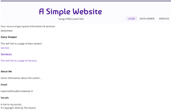
Notice that all of the style declaration have the nav element type as the main selector. This guarantees that only elements inside the navigation container are affected by these style rules. In lines 1-5 we position the navigation container at the bottom-right of the header container. In lines 7-9, we remove the default bullets from the list elements. In lines 11-15, we position the menu items on the left in the navigation container, and also specify the separation between each item. In lines 17-20, we transform the text of the menu items to upper-case, and in lines 22-28, we specify the color of the menu-item that is currently active. Reload the page to see now that the menu is in place. Your page should render similarly to the image in Figure 1.
Below the Header section we insert a container to display messages and to separate the menus and title from the content of the page. Insert the code below into the simple-website/styles/main.css file to specify the styling of the Spacer container.
|
1 2 3 4 5 6 7 8 9 10 11 12 13 14 15 16 17 18 19 |
/*--------*/ /* Spacer */ /*--------*/ #spacer { width:auto; height:50px; background-color:#4A2E75; position:relative; color:#fff; font-size:18px; } #spacer p { margin-top:22px; width:auto; position:absolute; left:50%; margin-left:-450px; } |
Here we use yet another CSS selector mechanism, the id selector. This selector mechanism is the most specific of all, as an HTML element id should be a unique id. Check the HTML code to see that we have assigned the id="spacer" to a section element. In our CSS file we use that id to specify the styles of that element. The CSS id selector uses a hash as a prefix to denote that it is an id selector (#spacer). In lines 4-11, we define the size, color and position of the container, and in lines 13-19, we specify margins and position of the paragraph element inside the spacer container. Reload the page to check the formatting of the Spacer. According to our design the Header and the Spacer elements will be rendered in all pages, that means that the HTML code of these two elements has to be included in all pages.
Featured Section
The first real content section of the page is the Featured Content section. Check the landing page design (in the Introduction section) to see how this section is supposed to look. To format this particular section, extent the simple-website/styles/main.css file with the following code:
|
1 2 3 4 5 6 7 8 9 10 11 12 13 14 15 16 17 18 19 20 21 22 23 24 25 26 27 28 29 30 31 32 33 34 35 36 37 38 |
/*----------*/ /* Features */ /*----------*/ #featured_content { width:auto; max-width:900px; margin:0 auto; padding:50px 0 45px 0; text-align: center; } #featured_content article { display: inline-flex; width:350px; font-size:14px; margin: 0 10px; position:relative; } #featured_content article p { line-height:25px; } #featured_content article h3 { font-size:20px; padding-top: 140px; margin-bottom:10px; } #featured_content article img { position:absolute; top:20px; left:85px; } #featured_content article a:hover { color:#9164d6; } |
In lines 4-10, we specify the position and size of the main container of this section making use of the CSS id selector. Here we also specify that the content of this container has to be aligned at the center. In lines 12-18 we format the width, margins and position of the three article elements of this section. In line 13, we make sure that the three article elements appear at the same vertical level by setting the display mode to in-line-flex. In lines 2-28 we format the paragraphs and titles inside each article.
In lines 30-34, we style the images inside each article. In lines 36-38, we alter the color of the text inside the link elements whenever the mouse hovers over the element.
This should all work nicely, however we have not actually included the images that we are styling. To include the images in the page, create a new folder called images inside the simple-website folder. The images of the Featured Content section can be found here: [ images.zip ]. Right-click on the link, to download the file, and then decompress them so they end up inside the simple-website/images folder (not in a subdirectory of that folder!). To include the missing images update the simple-website/index.html file as shown in Listing 7.
|
1 2 3 4 5 6 7 8 9 10 11 12 13 14 15 16 17 18 19 |
<section id="featured_content"> <article> <a href=""> <img src="images/dataviewerlogo.png" alt="data viewer"/> <h3>Data Viewer</h3> <p>This will link to a page of data viewers.</p> </a> </article> <article> <a href=""> <img src="images/serviceslogo.png" alt="services"/> <h3>Services</h3> <p>This will link to a page of services.</p> </a> </article> <br class="clear"/> </section> |
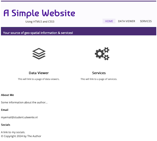
Reload the page to see the results, if all went well, you should now see page that looks similar to the image in Figure 2. Should anything be out of place, or not working as expected, then revisit you code and make the necessary corrections.
The Footer
The Footer section will also be common across the various pages of the site, so its content will be copied in the various HTML files that make up the site. Let's start with this section styling. Insert the code below at the end of the simple-website/styles/main.css file.
|
1 2 3 4 5 6 7 8 9 10 11 12 13 14 15 16 17 18 19 20 21 22 23 24 25 26 27 28 29 30 31 32 33 34 35 36 37 38 39 40 41 42 43 44 45 46 47 48 49 50 51 52 53 |
/*--------*/ /* Footer */ /*--------*/ footer { position:relative; clear:both; width:auto; height:175px; background:#333333; } footer .wrapper { line-height:20px; margin: 0 auto; padding-top:30px; width:auto; max-width:900px; font-size:12px; } footer .wrapper .column { font-family: 'Open Sans', sans-serif; color:#ababab; float:left; width:280px; margin-right:20px; } footer .wrapper .column a:hover { color:#fff; } footer .wrapper .column h4 { font-size: 16px; color:#fff; border-bottom: 1px solid #444444; padding:0 0 10px 0; margin-bottom: 10px; } #copyright { background:#1D1D1D; height:50px; position:absolute; bottom:0; left:0; width:100%; } #copyright .wrapper { padding-top:5px; color: #5e5e5e; font-size:14px; position:relative; } |
In lines 6–12, we format the section container. In lines 18–33, we format the section containers inside the footer, one corresponds to the copyright container and the other to the articles of the Footer section. In lines 14–16, we resize the images inside the right-hand side article so they feet in small containers, only 80 pixels wide.
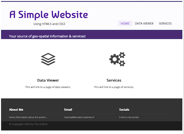
We have now completed the structuring and styling of the Landing Page for the Web site. Reload the page to see the final result. Figure 3 shows an image of the expected result.
In the next exercise we will focus our attention to the Data Viewer page...