Bar Chart
For all the sections that we have coded so far, we were only dealing with content that is static, that means icons and text, are predefined and will always be the same. The Chart section on the contrary is dynamic, we need to retrieve the data that will be rendered in the page from an external source, e.g., a database.
Server-Side Scripts
For the actual graph we have four decisions to make: 1) Which data will be used in the graph? 2) what is the appropriate type of graph? 3) what is the mechanism to generate it? and 4) what service do we use to get the data? For the demonstration of the site, we have chosen to display population data aggregated per province for which we have one discrete variable, provinces, and one value variable, number of inhabitants. This means that one of our options is a bar chart. Now, on the mechanism, we have seen during previous exercises how to generate graphs using the D3 JavaScript library, so we are going to settle for that.
Most probably there are such data services available out there with the data that we need, but the company we are working for has plenty of statistical data in its databases, therefore, we can create our own web service. As we saw in previous e lectures and exercises, when creating a service, we have to decide on the service type, the data source, the resources and the representation. In this case, we are going to go for a REST service that can deliver the response in both, JSON and XML formats. One important even critical aspect of a REST services is the URI. We need to produce a URI that clearly describes the specific resource that the user will get. The first part of our URI, the domain, is off course constraint by the infrastructure we are using. For the second part, the path, we are free to decide. Since we are working with data about provinces we can safely assume that population values will be one of the resources, provinces geometry another one, etc. Given that criteria can settle for a URI with the following structure:
The structure of the population services URI
· · · /<<SNUMBER>>/services/<<COUNTRY_NAME>>/<<ADMIN_LEVEL>>/<<VARIABLE>>/<<FORMAT>>
There are many options for defining the URI structure, but for our exercise this will suffice. To produce an example URI based on this structure, we only need to replace the placeholders with real values. This will result on a URI which looks as follows:
An example URI:
https://gisedu.itc.utwente.nl/student/<<SNUMBER>>/services/netherlands/provinces/population/json
Note that the example above still has one placeholder, which should be replaced with your own <<SNUMBER>>. Next, we need to map the URI to an existing script, for us this means a python script. To realize the translation of the URIs into the corresponding scripts for the service, we need to create the appropriate redirection rules. We will do that using a configuration file web.config. We will create a folder to contain all the service scripts under the root of our personal, web accessible, folder in the server. Create a folder called services inside in your root folder. The resulting URI for this folder is then:
Services folder path
\\gisedu.itc.utwente.nl\student\<<SNUMBER>>\services
Inside this folder, we will place the configuration file as well as the various python scripts required to realize the services. We will repeat the procedure that we used earlier during the exercises on REST. Create the services/web.config file with the following content:
|
1 2 3 4 5 6 7 8 9 10 11 12 13 14 15 16 17 18 |
<?xml version="1.0" encoding="UTF-8"?> <configuration> <system.webServer> <rewrite> <rules> <!-- Population --> <rule name="province population default"> <match url="^netherlands/provinces/population$" /> <action type="Rewrite" url="prov_population.py?country_name=netherlands;format=json" /> </rule> <rule name="province population"> <match url="^netherlands/provinces/population/(\b(json|xml)\b)$" /> <action type="Rewrite" url="prov_population.py?country_name=netherlands;format={R:1}" /> </rule> </rules> </rewrite> </system.webServer> </configuration> |
The web.config files allows us to specify how to handle the different URIs. We have specified two rules for handling requests for provinces population. We have included one rule to be used as default when a format is not specified by the user 7–10, and, one rule to handle complete requests 11–14, that is, including the format. To avoid having to specify one rule for every format, in line 12 we use a regular expression to handle the various format options. The chosen format is passed down to the script as a parameter using key value pair (KVP) format 13. Note that we have hard-coded the country name in the rule matching parameters 8, but here also regular expressions could be used so that we can handle any country.
With the URI in place we can proceed to create the script(s) to handle the service requests. The data we need for the service is located in our PostgreSQL server, in the netherlands.province table of the exercises Database. Use pgAdmin to check the structure of the table and also its contents. Although, for now, we only have data for The Netherlands, the REST service interface has been specified so that it can be used for any arbitrary country. Later on, we can update the script behind the service to produced data for other countries. Listing 26 shows the format of the JSON response of the service that we are going to create. The reported values per province include: an identifier, the name and abbreviation of the province, the total population and the deviation from the mean in millions.
|
1 2 3 4 5 6 7 8 |
[ { "id": "04", "prov_name": "Groningen", "pop": 580875.0, "popdev": -0.8133, "prov_abbr": "GR" }, { "id": "01", "prov_name": "Drenthe", "pop": 490807.0, "popdev": -0.9034, "prov_abbr": "DR" }, dotdotdot { "id": "11", "prov_name": "Zuid-Holland", "pop": 3552410.0, "popdev": 2.1582, "prov_abbr": "ZH" } ] |
To generate the desired output, we first need to write the corresponding SQL code. Listing 27 shows the code. The best way to understand what is happening is to run it, to do so simply open a query window in pgAdmin and then paste and execute the code.
|
1 2 3 4 5 6 7 8 9 10 11 |
WITH p AS (SELECT avg(aantal_inw) as avg FROM netherlands.province where water = 'NEE') SELECT prov_id AS id, prov_name, prov_abbr, ST_Area(geom) as prov_area, trim(to_char(aantal_inw,'9999999999D99'))::real AS pop, trim(to_char((aantal_inw - p.avg)/1000000,'99999999D9999'))::real AS popdev FROM netherlands.province, p WHERE water = 'NEE' ORDER BY 3; |
The first part of the query, lines 1–2, calculates the average for every province. The second part, lines 3–11, produces the columns required fro the output: a unique identifier (id), the name of the province (prov_name), the province code (prov_abbr), The number of inhabitants (pop), the population deviation from the mean in millions (popdev) and the province abbreviation.
As we know there is no direct communication between the browser and the database. There needs to be a trusted party in between the two. We will use Python for the script to handle the population service. The name of the script is already part of the redirection rules (see lines 9 and 13 in Listing 25). The script will extract the data from the database using the code in Listing 27 and then will format the data appropriately, following the type of format specified in the request, that is JSON or XML. To generate the service script, create the services/prov_population.py file and place the following code inside:
|
1 2 3 4 5 6 7 8 9 10 11 12 13 14 15 16 17 18 19 20 21 22 23 24 25 26 27 28 29 30 31 32 33 34 35 36 37 38 39 40 41 42 43 |
import cgi import json import psycopg2 from psycopg2.extras import RealDictCursor pg = psycopg2.connect("dbname='exercises' host='gisedu.itc.utwente.nl' port='5432' \ user='exercises' password='exercises'") dataQuery = "WITH p AS \ (SELECT avg(aantal_inw) as avg FROM netherlands.province where water = 'NEE') \ SELECT prov_id AS id, prov_name, prov_abbr, \ trim(to_char(aantal_inw,'9999999999D99'))::real AS pop, \ trim(to_char((aantal_inw-p.avg)/1000000,'99999999D9999'))::real AS popdev \ FROM netherlands.province, p \ WHERE water = 'NEE' \ ORDER BY 3;" params = cgi.FieldStorage() dataFormat = params.getvalue('format') if dataFormat.lower() == 'json': records_query = pg.cursor(cursor_factory=RealDictCursor) records_query.execute(dataQuery) result = json.dumps(records_query.fetchall()) print ("Content-type: application/json; charset=utf-8") print () print (result.replace("'",'"')) else: records_query = pg.cursor() xmlQuery = dataQuery.replace("'","''") records_query.execute("SELECT query_to_xml('%s', true, false, '');" % (xmlQuery)) result = str(records_query.fetchall()) result = result.replace("[('","").replace("',)]","").replace("\\n","") print ("Content-type: text/xml; charset=utf-8") print () print (result) |
The script starts by importing various libraries, which contain functionality needed for the processing steps that follow1–4. With those in place we can proceed. We start by making the connection to the database 10–11. reading the parameters associated with the request and assign them to script variables 6 7. Next, 9 16, we specify the query to generate population data. Then we read the format parameter associated with the request and assign it to script variable, 18 19. If the chosen format is JSON, 21, we proceed to extract the data form the database using the predefined query as is, 23 26. In lines 28 30 we produce the JSON output. It is important to state the appropriate content-type for the response, 28 so that the content of the response can be parsed properly by the client application. If, on the contrary, the requested format is XML, 31, we process the query through an XML database function to format the output accordingly, 34–36. We then produce the output and again specify the correct content-type, 41–43. Test the service by making a request using the browser address bar. Use the example URI that we formed earlier on which looks like:
Population Service URI:
https://gisedu.itc.utwente.nl/student/<<SNUMBER>>/services/netherlands/provinces/population/json
The browser should now be able to retrieve population data from the database. Test both formats to make sure that everything works well. Also try a request without specifying the format to check the default service settings. If the service does not behave as expected, revisit the various code snippets to solve the problem.
Client-Side Scripts
With the population service up and running, we can turn our attention back to the Data Viewer page and start working on the client-side scripts. We will be using JavaScript for all the scripting related with the browser. For the graph, we will create a function using D3 to read the data from the population service and generate a bar chart. Let's create a new folder inside the simple-website folder, and call it scripts. Inside this folder, create a new file and call it viewer.js. Place the following JavaScript code inside the simple-website/scripts/viewer.js file.
|
1 2 3 4 5 6 7 8 9 10 11 12 13 14 15 16 17 18 19 20 21 22 23 24 25 26 27 28 29 30 31 32 33 34 35 36 37 38 39 40 41 42 43 44 45 46 47 48 49 50 51 52 |
/* Name: viewer.js Date: Mar 2016 Description: Functions of the simple-website exercise (data viewer page). Version: 1.0 */ /*-- Draws a bar chart based on mean population deviation per province */ function drawBarChart(){ var margin = {top: 20, right: 20, bottom: 45, left: 50}, width = 800 - margin.left - margin.right, height = 300 - margin.top - margin.bottom; var x = d3.scaleBand().rangeRound([0, width]).padding(0.1); var y = d3.scaleLinear().rangeRound([height, 0]); var barChart = d3.select("#chart_container") .append("svg") .attr("width", width + margin.left + margin.right) .attr("height", height + margin.top + margin.bottom) .append("g") .attr("transform", "translate(" + margin.left + "," + margin.top + ")"); d3.json("/student/SSNUMBERR/services/netherlands/provinces/population/json", function(err, provinces){ x.domain(provinces.map(function(p) { return p.prov_abbr; })); y.domain([ d3.min(provinces, function(p) { return p.popdev - 0.1; }), d3.max(provinces, function(p) { return p.popdev + 0.1; }) ]); barChart.selectAll(".bar") .data(provinces) .enter().append("rect") .attr("id", function(p) { return "bar_" + p.prov_abbr; }) .attr("class", "bar") .attr("x", function(p) { return x(p.prov_abbr); }) .attr("y", function(p) { return y(Math.max(0, p.popdev)); }) .attr("width", x.bandwidth()) .attr("height", function(p) { return Math.abs(y(p.popdev) - y(0)); }); }); }; /*---*/ /*-- Initialization function --*/ function init(){ drawBarChart(); }; /*---*/ |
We have already work with JavaScript and more specifically D3 in the exercises, so the notation of this snippet should already look familiar. In lines 11–13 we define the variables for size and margins of the chart. The function name is drawBarChart(). In lines 15–16 we specify the methods to determine the x and y coordinates in the chart of an given (population) value. Note how the functions have dependencies with the size variables defined before. In lines 18–23 we select the HTML element to contain the chart (using the appropriate identifier 'chart-container') and add to it one svg element and one g element, both with its corresponding attributes. In lines 25–41 we define the function that draws the chart. The first parameter of the function is the reference to the service that provides the population data. The second parameter is a callback function to handle the service response. the provinces variable will contain the population data received as a service response. In lines 26–30 we determine the value ranges of the population data. In lines 32–40 we add bars to the chart, one rect element for every record in the provinces array. For each individual record (province), size, position and style attributes are calculated/determined and associated to its graphical element.
We also need to trigger the function drawBarChart() when the time is right, that is when the page is ready. To do that we use an initialization function, 47–51. We will alter on make sure that the init() function gets triggered after all elements of the page have been rendered in the browser.
To be able to render the result, we need to include our script and the D3 libraries into the page. To do so, update the simple-website/data-viewer.html file as follows:
|
1 2 3 4 5 6 7 8 9 10 11 12 13 14 15 16 |
dotdotdot <link rel="stylesheet" href="styles/main.css" type="text/css" media="screen" /> <link rel="stylesheet" href="styles/viewer.css" type="text/css" media="screen" /> <!-- scripts --> <script src="https://gisedu.itc.utwente.nl/exercise/libraries/d3js/v4.13.0/d3.min.js"></script> <script src="https://gisedu.itc.utwente.nl/exercise/libraries/d3js/d3-tip_v4/d3-tip.js"></script> <script src="scripts/viewer.js"></script> </head> <body onload="init()"> <section class="container header"> <header> dotdotdot |
In line 12 we associate the init() function with the onload event of the page. A function associated with the onload event of a page, will be executed when the page finishes its loading process, which is exactly when we need our init() function to be executed. We could have directly place the charting function here, but we expect some other initialization tasks as well, so this construction with an initialization function gives us that flexibility. Reload the page by hitting CTRL+F5. The page should now include a very simple graph.
Although the bars are in place, it is important to remember that one of the keys to effective visualization is communication. We should make explicit to the user all the relevant information about the data, so that he/she can make sense of the visualization. To provide this understanding it is essential to include labels, captions, legends and any other relevant explanatory elements. Let's start by adding axes and labels. Update the simple-website/scripts/viewer.js file so that it include the following code:
|
1 2 3 4 5 6 7 8 9 10 11 12 13 14 15 16 17 18 19 20 21 22 23 24 25 26 27 28 29 30 31 32 33 34 35 36 37 38 39 40 41 42 43 44 45 46 47 48 49 50 51 |
dotdotdot var x = d3.scaleBand().rangeRound([0, width]).padding(0.1); var y = d3.scaleLinear().rangeRound([height, 0]); var xAxis = d3.axisBottom(x); var yAxis = d3.axisLeft(y); var number_formatting = d3.format(",.0f"); var barChart = d3.select("#chart-div") .append("svg") dotdotdot x.domain(provinces.map(function(p) { return p.prov_abbr; })); y.domain([ d3.min(provinces, function(p) { return p.popdev - 0.1; }), d3.max(provinces, function(p) { return p.popdev + 0.1; }) ]); barChart.append("g") .attr("class", "x axis") .attr("transform", "translate(0," + height + ")") .call(xAxis) .append("text") .attr("x", width/2) .attr("y", 40) .attr("fill", "#000") .style("text-anchor", "middle") .text("Deviation per Province [Mean: " + number_formatting(d3.mean(provinces, function(p) { return p.pop; })) + "]" ); barChart.append("g") .attr("class", "y axis") .call(yAxis) .append("text") .attr("x", 5) .attr("y", 3) .attr("fill", "#000") .style("text-anchor", "start") .text("Millions of Inhabitants"); barChart.selectAll(".bar") .data(provinces) dotdotdot |
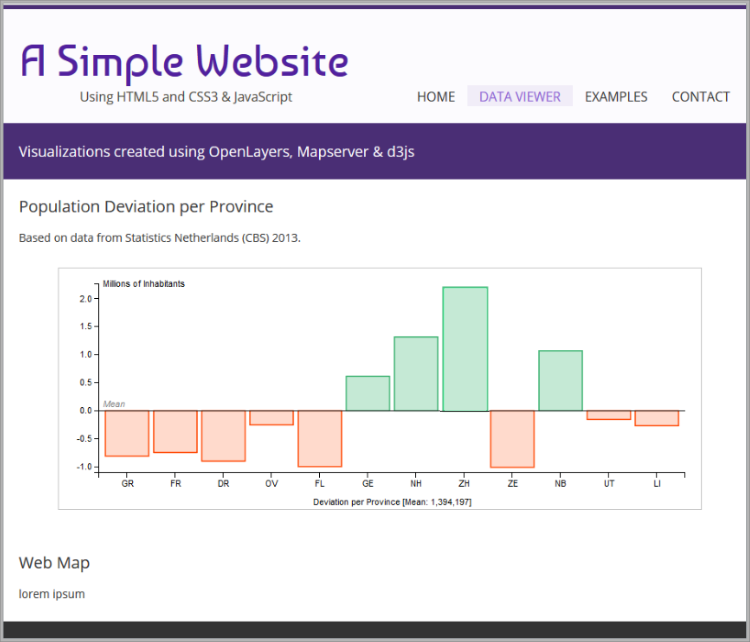
To enhance the visualization of the bar chart, we first create two axes elements 6–8, and then, we add these axes to the chart 25–46. For each axis, we also include explanatory titles. If you reload the page now, the chart should look similar to the image shown in Figure 17.
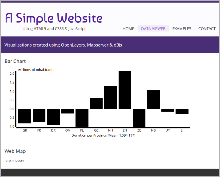
Chart Style
We now have a chart, yes, but it does not really look like much, or does it? D3 is only responsible for the generation of the chart elements based on the data and its values. the rest is up to style rules. Notice that we have already assigned classes to some of the relevant chart's elements. We have, for example, assigned the bar class to the graph bars (see Listing 29, line 40). Similarly, we have assigned the x, y and axis classes to the chart axes (see lines 29 and 41 in Listing 31). We are now going to define the style parameters of these classes and also for the chart container. Update the simple-website/styles/viewer.css file using the following code
|
1 2 3 4 5 6 7 8 9 10 11 12 13 14 15 16 17 |
dotdotdot; /*-------*/ /* Chart */ /*-------*/ #chart_container svg { border: solid 1px #C0C0C0; margin: 20px auto; display: block; } .bar{ stroke: MediumSeaGreen; stroke-width: 1.5px; fill: MediumSeaGreen; fill-opacity: .4; } |
With these style rules, we have repositioned the container, 6–10. Then we have altered the presentation of the actual bars, 12–17. Reload the page to see the changes. The chart elements have now been streamlined to enhance their readability and appeal.
There is however more opportunity for improvement. Since there is both positive and negative deviation from the population mean, we can differentiate the bars of provinces that are above the average from those that are below, so let's do that. Additionally, we will include one more axis element to highlight the mean. To do this we need to adapt the elements of the chart and then produce the corresponding styles. Update the simple-website/scripts/viewer.js file as shown below.
|
1 2 3 4 5 6 7 8 9 10 11 12 13 14 15 16 17 18 19 20 21 22 23 24 25 26 27 28 29 30 31 32 33 |
dotdotdot barChart.selectAll(".bar") .data(provinces) .enter().append("rect") .attr("id", function(p) { return "bar_" + p.prov_name; }) .attr("class", function(p) { return p.popdev < 0 ? "bar negative" : "bar positive"; }) .attr("x", function(p) { return x(p.prov_abbr); }) .attr("y", function(p) { return y(Math.max(0, p.popdev)); }) .attr("width", x.rangeBand()) .attr("height", function(p) { return Math.abs(y(p.popdev) - y(0)); }); barChart.append("g") .attr("class", "x axis") .append("line") .attr("stroke", "#000") .attr("y1", y(0)) .attr("y2", y(0)) .attr("x2", width); barChart.append("g") .attr("class", "x axis mean") .append("text") .attr("x", 5) .attr("y", y(0)-4) .style("text-anchor", "start") .text("Mean"); }); }; /*---*/ dotdotdot |
In line 7 we have modified the command that assigns the CSS class to the bars in the chart, so that different classes are assigned to the bars based on whether the deviation from the mean is positive or negative. In lines 13–27 we insert two new elements to the chart. One axis and its corresponding title or label. Now we can create the appropriate style rules for the new classes. Modify the simple-website/styles/viewer.css file as follows:
|
1 2 3 4 5 6 7 8 9 10 11 12 13 14 15 16 17 18 19 20 21 22 23 24 25 26 |
dotdotdot; #chart_container svg { border: solid 1px #C0C0C0; margin: 20px auto; display: block; } .bar.positive{ stroke:MediumSeaGreen; stroke-width:1.5px; fill:MediumSeaGreen; fill-opacity:.4; } .bar.negative{ stroke:OrangeRed; stroke-width:1.5px; fill:OrangeRed; fill-opacity:.2; } .x.axis.mean { fill:Grey; font-style:italic; } |
These new style rules should be easy to understand. The last change needed for the Chart section is a proper title and a reference to the data source. Use the code in Listing 35 to update the simple-website/data-viewer.html file.
|
1 2 3 4 5 6 7 8 9 10 11 12 13 14 |
dotdotdot <!-- Chart Section --> <section class="one-column"> <article id="bar_chart"> <h2>Population Deviation per Province</h2> <div id="chart_container"></div> <p>Based on data from <a href="http://www.cbs.nl/en-GB/menu/home/default.htm" target="_blank"> Statistics Netherlands (CBS)</a> 2015.</p> </article> <!-- bar_chart --> <br class="clear"/> </section> dotdotdot |
This is it. We have completed the customization of the chart so that it is visualized in the most effective manner. Reload the page to see the completed bar chart, which should look like the image in Figure 18. In the next section we will include a map viewer and will also synchronize one of the layers with the chart to enhance communication.