Adding Style
Remember that the browser reads the HTML code sequentially and renders the content accordingly. This means, if you load the page in the browser as it is now, the existing content will simply render one after the other as it is in the HTML file. Thus far the only aspect that is not the result of our own coding is the current style. We will now take control of how elements are rendered in the page, and what their behaviour should be, by specifying a set of styles via CSS selectors. CSS selectors are pieces of code that specify the presentation of specific elements of a page.
By default all browsers apply pre-defined style definitions to most HTML elements, and that holds true for the elements in our page. In Figure 9 you can clearly see the distinction between the different levels of headings, and also the standard presentation of the unordered list, etc. All of which is part of the set of default browser styles, which by the way vary from vendor to vendor. Firefox follows a different approach to that of Chrome or Safari, etc. Naturally, we want to have control on the presentation of the elements of the page and avoid any misfits due to styles we are unaware off. So let's configure our page so that we can start applying own own styles. Proceed to modify the simple-website/index.html file as shown in Listing 7.
|
1 2 3 4 5 6 7 8 9 10 11 12 13 14 15 |
<!doctype html> <html lang="en"> <head> <meta charset="utf-8" /> <meta name="viewport" content="width=device-width, initial-scale=1.0"/> <title>A Simple Website</title> <!-- styles --> <link rel='stylesheet' href='https://fonts.googleapis.com/css?family=Open+Sans|Baumans' type='text/css'> <link rel="stylesheet" href="styles/reset.css" type="text/css" media="screen" /> <link rel="stylesheet" href="styles/main.css" type="text/css" media="screen" /> </head> dotdotdot |
The link elements are used to upload the content of additional files when the page is rendered. Having separate files with specific purposes makes it easy to maintain the site and also reduces code duplication. You can load file from your own server or from any remote location on the Web. Here we are loading three files. In line 10 we load one of the public font types available in the Google Repository. This is an important design decision that you have to make, but for this exercise we are not going to discuss the arguments for the specific choice.
In line 12 we include the file that will eventually contain our own style specifications. To create this style definition file, first create a new folder called styles inside the simple-website folder. Then, inside this new folder, create a new file and name it main.css. We will for now leave this file empty. We just need the file to exist so that the browser does not report an error. The relative URL of this style file should be simple-website/styles/main.css
In line 11, we load a so-called reset stylesheet. The goal of a reset stylesheet is to eliminate browser inconsistencies in style aspects of the page, things like, line heights, margins, font sizes of headings, and so. The reset styles used here are intentionally very generic, and can to be used somewhere else they should be tweaked, edited, extended, and otherwise tuned to match your specific reset baseline. The reset stylesheet file for this exercise, reset.css, can be found here: [ Reset Stylesheet ]. Right-click on the link, to download the file, and then decompress it inside the simple-website/styles directory. There are many resources in the Web that you can use when it comes to a reset stylesheet. You can find some useful information about reset stylesheets at the following address: CSS Resets
Reload the page to see the results. At this point we get a very clean page with no font sizes, or tabs or spacing, etc. The page should look like the image in Figure 10.
We can now proceed to format the content of the page and we will start with the so-called, global rules. These are basically style rules that affect all elements in the page. So every paragraph tag or every link tag in the page receives the same treatment. Later on you can use the cascading principle of the CSS code to alter only certain instances of a tag. That is, for example, certain paragraph element inside a specific section or article element. Update the simple-website/styles/main.css file with the content in Listing 8.
|
1 2 3 4 5 6 7 8 9 10 11 12 13 14 15 16 17 18 19 20 21 22 23 24 25 26 27 28 29 30 31 32 33 34 35 36 37 38 39 40 41 42 43 44 45 46 47 48 49 50 51 52 53 54 55 56 57 58 59 60 61 62 63 |
/*-------------------------------------------------------------- Name: main.css Date: January 2016 Description: Base styles for the - Simple Website - exercise Version: 2.0 --------------------------------------------------------------*/ /* ------ */ /* Global */ /* ------ */ body { font-family:'Open Sans', sans-serif; border-top:5px solid #4A2E75; background:#ffffff; color:#333333; } p { margin:5px 0; line-height:25px; } a { text-decoration:none; color:inherit; transition:color .5s ease; } a:hover { color:#9164d6; } strong { font-weight:bold; } hr { background-color:#D6D0C1; border:0; height:1px; margin:20px 0; } figcaption { line-height:25px; font-size:14px; width:200px; } figcaption strong { border-bottom:1px solid #D6D0C1; padding-bottom:10px; margin:10px 0; display:block; } /*------*/ /* Misc */ /*------*/ .clear { clear:both; } |
It is good practice to always add comments to a CSS file so that it is easy to understand what style rules apply to what part of the page, etc. In this code snippet we have use the element tags themselves as selectors, e.g., p, a. So for example in lines 18 21 we state that all paragraph elements on the page should have a specific margin and line separation. In lines 11 16 we specify the style for the body element. This includes the font family 12, the background color 14, and the text color 15. In line 21, we create a 5 pixels stripe at the top of the page as a style feature to separate the page from the browser menus, favourites list, etc. Try reloading the page to see the results, you will notice purple the stripe at the top, you will also see that the font has changed, and that the links have blended in, they are no longer differentiable from other text. Study all the declarations to familiarize with some of the style commands. The purpose of this exercise is not to master CSS but to guide you through its use. This means that we will not go into details on the various style declarations. You should use the reading materials and web references to get more insight into CSS.
On fundamental element of CSS are the so-called selectors. We have already discussed the use of elements names as selectors, but there are many other options. If you check line 29, you will notice that the selector includes an element and a property of the element, also known as a pseudo-class (a:hover). The pseudo-class selector specifies that the style should only be applied when the property defined by the pseudo-class is true. In this case it means that if the mouse passes over an a element, automatically the browser will alter the text color of the element, from #333333 line 25, to #9164d6, line 30. The color will return to normal when the mouse no longer hovers over the element. There a many other selectors. Later on in the exercise we will use some of them, but there are many selectors. For an overview of the possibilities visit: CSS Selector Reference
The Header
With the global styles in place we can now start to work on the individual sections of the page starting with the Header section. Insert the code below at the end of the simple-website/styles/main.css file.
|
1 2 3 4 5 6 7 8 9 10 11 12 13 14 15 16 17 18 19 20 21 22 23 24 25 26 27 28 29 30 31 32 33 34 |
dotdotdot; /*--------*/ /* Header */ /*--------*/ .container { width:100%; padding:1px; } .container.header { background:rgba(241,235,250,0.2); height:auto; } header { position:relative; width:auto; max-width:900px; margin:0 auto 20px auto; } header h1 { margin:35px 0 0 0; font-size:55px; color:#51209E; font-family:'Baumans', cursive; } header p { font-size:16px; color:#4A463B; margin-left:132px; } |
Now we have added some new rules to target HTML elements belonging only to the Header section. This requires the use of a different selector technique, which is the class selector. If you check you HTML code, for example line 6 in Listing 2, You will notice that the div element has been assigned two classes container and header. Now in the style declaration we can use those two classes to target that container element for a set of styles, lines 11–14 in Listing 9. The CSS class selector uses a dot as a prefix to denote that it is a class selector (.container). The specific style rules applied to the selected container, target its background color and size. In lines 23 and 30 we used the so-called descendant selector to target paragraph and title elements inside the Header section. Reload the page to see the effect of the styles. The position and font size of the title have changed and they are now render according to our design wishes or criteria.
The next component of the Header section that needs attention is the navigation menu. To apply style to the menu elements update the simple-website/styles/main.css file as follows:
|
1 2 3 4 5 6 7 8 9 10 11 12 13 14 15 16 17 18 19 20 21 22 23 24 25 26 27 28 29 30 |
dotdotdot; nav { position:absolute; right:0; bottom:0; } nav ul { list-style:none; } nav ul li { display:block; float:left; padding:3px 15px; } nav ul li a { text-transform:uppercase; transition:all .25s ease; } nav ul li.active { background:#f1edf8; } nav ul li.active a{ color:#9164d6; } |
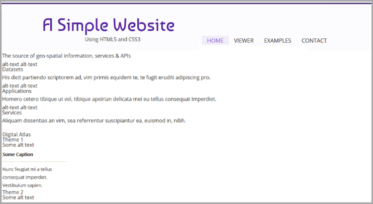
Notice that all of the style declaration have the nav element type as the main selector. This guarantees that only elements inside the navigation container are affected by the style rules. In lines 3–7 we position the navigation container at the bottom-right of the header container. In lines 9–11, we remove the bullets from the list elements. In lines 13–16, we position the menu items on the left of the navigation container, and also specify the separation between each item. In lines 19–22, we transform the text of the menu items to upper-case, and in lines 24–30, we specify the color of the item that corresponds to the URL currently loaded in the browser. Reload the page to see now that the menu is in place. Your page should render similarly to the image in Figure 11.
Right bellow the Header section we prescribe a container to display messages and to separate the menus and title from the content of the page. Insert the code below into the simple-website/styles/main.css file to specify the styling of the Spacer container.
|
1 2 3 4 5 6 7 8 9 10 11 12 13 14 15 16 17 18 19 20 21 |
dotdotdot; /*--------*/ /* Spacer */ /*--------*/ #spacer { width:auto; height:70px; background-color:#4A2E75; position:relative; color:#fff; font-size:18px; } #spacer p { margin-top:22px; width:auto; position:absolute; left:50%; margin-left:-450px; } |
Here we use yet another CSS selector mechanism which by element id. This selector mechanism is the most specific of all as element ids are considered to be unique. Check line 21 in Listing 2. We have assigned the spacer id to a section element. In our CSS file we use that id to specify the styles of that element. The CSS id selector uses a hash as a prefix to denote that it is an id selector (#spacer). In lines 6–13, we define the size, color and position of the container, and in lines 15–21, we specify margins and position of the paragraph element inside the spacer container. Reload the page to check the formatting of the Spacer. According to our design the Header and the Spacer elements will be render in all pages, that means that the HTML code of these two elements has to be included in all pages.
Featured Section
The first real content section of the page is the Featured Content section. Check the landing page design (Figure 5) to remember how this section has to be rendered. To format this particular section extend the simple-website/styles/main.css file with the following code:
|
1 2 3 4 5 6 7 8 9 10 11 12 13 14 15 16 17 18 19 20 21 22 23 24 25 26 27 28 29 30 31 32 33 34 35 36 37 38 39 40 41 42 43 44 45 |
dotdotdot; /*----------*/ /* Features */ /*----------*/ #featured_content { width:auto; max-width:900px; margin:0 auto; padding:50px 0 45px 0; text-align: center; } #featured_content article { display: inline-flex; width:250px; font-size:14px; margin: 0 10px; position:relative; } #featured_content article p { line-height:25px; } #featured_content article h3 { font-size:20px; padding-top: 140px; margin-bottom:10px; } #featured_content article img { position:absolute; top:20px; left:85px; transition: opacity .5s ease-in-out; } #featured_content article a:hover { color:#9164d6; } #featured_content article a:hover > img.top-icon { opacity:0; } |
In lines 6–12, we specify the position and size of the main container of this section making use of the CSS id selector. Here we also specify that the content of this container has to be aligned at the center. In lines 14–20 we format the width, margins and position of the three article elements of this section. In line 15, we make sure that the three article elements appear at the same level or in-line. In lines 22–30 we format the paragraphs and titles inside each article.
In lines 32–37, we specify the position of the images inside each article. If you remember well, we have placed two image elements inside each article (see Listing 3, lines 9–10, for example). The style that we have defined affects all image elements equally, that means that the images will be placed one on top of the other. This means that as it is the only image visible will be the one that corresponds to the second image tag. (Line 8 in Listing 13, for example). IN the style definition of the images, we also specify in line 36 that, if the opacity of the images is manipulated by any style rule, the change in opacity should be applied gradually, in this case the transition should last0.5 seconds from one state to the next. This command does not itself alter the opacity of the elements.
In lines 39–41, we alter the color of the text inside the link elements whenever the mouse hovers over the element. Now it gets interesting. In lines, 19–22, we specify that, when the mouse hovers over a link element, the opacity of the image element inside, which belongs to the class top-icon, should be made equal to zero. This means, the image will become invisible. This change takes place gradually because of the rule that was declared earlier in line 36. In this case we are using the CSS parent-of selector, which uses a greater-than symbol to denote the parenthood relationship (a:hover > img.top-icon). Note that this is only one of the possible approaches to achieve such result.
This should all work nicely, however we are yet to include the images that we are styling. To include the missing images first update the simple-website/index.html file as shown in Listing 13.
|
1 2 3 4 5 6 7 8 9 10 11 12 13 14 15 16 17 18 19 20 21 22 23 24 25 26 27 28 29 30 31 32 |
dotdotdot <!-- Featured Section --> <section id="featured_content"> <article> <a href="javascript:void(0)"> <img src="images/feature-1-purple.png" alt="datasets"/> <img class="top-icon" src="images/feature-1-grey.png" alt="datasets"/> <h3>Datasets</h3> <p>His dicit partiendo scriptorem ad, vim primis equidem te, te fugit eruditi adipiscing pro.</p> </a> </article> <article> <a href="javascript:void(0)"> <img src="images/feature-2-purple.png" alt="applications"/> <img class="top-icon" src="images/feature-2-grey.png" alt="applications"/> <h3>Applications</h3> <p>Homero cetero tibique ut vel, tibique apeirian delicata mei eu tellus consequat imperdiet.</p> </a> </article> <article> <a href="javascript:void(0)"> <img src="images/feature-3-purple.png" alt="services"/> <img class="top-icon" src="images/feature-3-grey.png" alt="services"/> <h3>Services</h3> <p>Aliquam dissentias an vim, sea referrentur suscipiantur ea, euismod in, nibh.</p> </a> </article> dotdotdot |
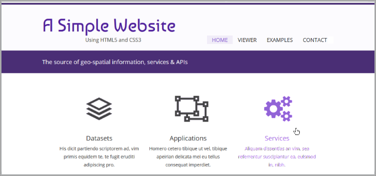
Next we add the image files. To include the images in the page, create a new folder called images inside the simple-website folder. The images of the Featured Content section can be found here: [ Featured-Images ]. Right-click on the link, to download the file, and then decompress it inside the simple-website/images folder. Reload the page to see the results, if all went well, you should now see page that looks similar to the image in Figure 12, containing the icons that respond to the mouse interaction. Should anything be out of place, or not working as expected, then revisit you code and make the necessary corrections. Note that Figure 12 only shows the content that we have styled so far, the rest has simply been omitted here but should still show in the browser.
Atlas Section
As we move on with the styling of the page we have more opportunities to explore the possibilities of CSS styling rules. Let's add some more CSS code to style the Atlas section of the page. Insert the following code into the simple-website/styles/main.css file.
|
1 2 3 4 5 6 7 8 9 10 11 12 13 14 15 16 17 18 19 20 21 22 23 24 25 26 27 28 29 30 31 32 33 34 35 36 37 38 39 40 41 42 43 44 45 46 47 48 49 50 51 52 |
dotdotdot; /*-------*/ /* Atlas */ /*-------*/ .container.four-cols { background:rgba(242,242,242,0.6); height:auto; padding-bottom:20px; } #atlas_columns, #cloud_columns { line-height:25px; clear:both; width:auto; max-width:900px; margin:0 auto; } #atlas_columns h2, #cloud_columns h3 { font-size:20px; border-bottom:1px solid #D6D0C1; padding:20px 0; margin-bottom: 20px; } #atlas_columns .img-item { float:left; margin:0 25px 20px 0; } #atlas_columns .img-item a { position:relative; display:block; } .thumb-screen { display:block; position:absolute; top:0; left:0; width:100%; height:110px; background:#000; z-index:99; opacity:0; transition: opacity .5s ease; } .thumb-screen:hover { opacity:0.3; } |
In lines 6–10, we style the background and internal margin of the outermost container of the Atlas section. This produces a grey stripe across the whole width of the page. In lines 12–18, we define the size and margins of the section container. In lines 20–25, we style the titles of each of the four articles inside the section. Incidentally the style of the container and title of the Cloud section are exactly the same as for the Atlas section, so they are both defined here to reduce unnecessary duplication.
In lines 27–30, we format the article elements. The width of the article containers will be define by the size of the image that will be placed inside. In lines 32–35, we format the link elements inside the articles. In lines 37–48, we format the span elements that are members of the thumb-screen class. These style rules fill the element with a black background and make it exactly of the same size as the image that will be place in the articles. By default this black container is invisible because we have set its opacity to zero (line 46). In lines 20–25, we make this black container visible, but transparent, as a response to its interaction with the mouse. The resulting effect simulates the activation of a link element. By now you might have noticed that we have implemented this same behaviour in different ways throughout the page. Such variety in formatting styles is not required but since this is an educational exercise, some rules can be broken. Reload the page to see the results.
The images for this section are also missing, so it is now time to include them in the page. The images of the Atlas section can be found here: [ Atlas-Images ]. Right-click on the link, to download the file, and then decompress it inside the simple-website/images folder. Next, update the simple-website/index.html file as shown in Listing 15.
|
1 2 3 4 5 6 7 8 9 10 11 12 13 14 15 16 17 18 19 20 21 22 23 24 25 26 27 28 29 30 31 32 33 34 35 36 37 38 39 40 |
dotdotdot <h2>Digital Atlas</h2> <article class="img-item"> <h3>Theme 1</h3> <figure> <a href="images/world_map-1.png" target="_blank" title="Theme 1"> <span class="thumb-screen"></span> <img src="images/world_map-1-small.png" alt="Theme 1"/> </a> dotdotdot <h3>Theme 2</h3> <figure> <a href="images/world_map-2.png" target="_blank" title="Theme 2"> <span class="thumb-screen"></span> <img src="images/world_map-2-small.png" alt="Theme 2"/> </a> dotdotdot <h3>Theme 3</h3> <figure> <a href="images/world_map-3.png" target="_blank" title="Theme 3"> <span class="thumb-screen"></span> <img src="images/world_map-3-small.png" alt="Theme 3"/> </a> dotdotdot <h3>Theme 4</h3> <figure> <a href="images/world_map-4.png" target="_blank" title="Theme 4"> <span class="thumb-screen"></span> <img src="images/world_map-4-small.png" alt="Theme 4"/> </a> <figcaption> dotdotdot |
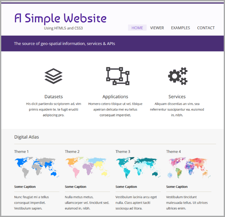
Once you are done, reload the page to render the new images. The current look and feel of the page should resemble the image in Figure 13. Again, should anything be missing or out of place, proceed to repair the code.
Cloud Section
The last of the content sections is the Cloud section. This section is formatted with two columns, the left column with one element and the right column with two elements (see Figure 7). The rules for styling this section are shown in Listing 16, insert them in the simple-website/styles/main.css file.
|
1 2 3 4 5 6 7 8 9 10 11 12 13 14 15 16 17 18 19 20 21 22 23 24 25 26 27 28 29 30 31 32 33 34 35 36 37 38 39 40 41 42 43 44 |
dotdotdot; /*-------*/ /* Cloud */ /*-------*/ #cloud_columns article.column1, #cloud_columns .column2 { margin: 40px 0; font-size:14px; float:left; width:auto; max-width:450px; } #cloud_columns .column2 { margin:90px 0; } .row { position:relative; margin:40px 0 0 50px; float:right; width:350px; } .row img { float:left; } .row p { margin-left:100px; } .cloud { top:0; left:0; position:absolute; width:auto; height:80px; transition:opacity .5s ease-in-out; } .cloud.top-icon:hover { opacity:0; } |
Most of what happens here has already been discussed in other sections so we will not repeat ourselves. Having said that, this is a good moment to reflect on the process we are following. We first created the structure of the sections we plain HTML and then we altered the visual style of the elements. This encompasses two separate steps but they are by no means independent. targeting and styling each section is only possible, because the mark-up already exist to enable the desired visual presentation. For example, the style rules in lines 37–48 are responsible for stacking the two articles of the right column of this section. But this is only possible because the HTML code already separates and classifies the two articles as rows.
The images of the Cloud section can be found here: [ Cloud-Images ]. Right-click on the link, to download the file, and then decompress it inside the simple-website/images folder. To add the images to the page modify the simple-website/index.html file as follows:
|
1 2 3 4 5 6 7 8 9 10 11 12 13 14 15 16 17 18 19 20 21 22 23 24 25 |
dotdotdot <section class="column2"> <article class="row"> <a href="javascript:void(0)" title="Download Files"> <img src="images/cloud-download-purple.png" class="cloud" alt="Download Files"/> <img src="images/cloud-download-grey.png" class="cloud top-icon" alt="Download Files"/> </a> <p>Tota luptatum vivendum eam id, utamur admodum senserit at pro, at cum vero sapientem.</p> </article> <article class="row"> <a href="javascript:void(0)" title="Upload Files"> <img src="images/cloud-upload-purple.png" class="cloud" alt="Upload Files"/> <img src="images/cloud-upload-grey.png" class="cloud top-icon" alt="Upload Files"/> </a> <p>Quot saepe theophrastus at has, sit eu ancillae persecuti intellegebat.</p> </article> </section> <br class="clear"/> </section> <!-- text_columns --> <footer> dotdotdot |
This completes the styling of the Cloud section. Reload the page and test the response of the styling of the various elements with the mouse and also by resizing the browser window.
The Footer
The Footer section will also be common across the various pages of the site, so its content will be copied in the various HTML files that make up the site. Let's start with this section styling. Insert the code below at the end of the simple-website/styles/main.css file.
|
1 2 3 4 5 6 7 8 9 10 11 12 13 14 15 16 17 18 19 20 21 22 23 24 25 26 27 28 29 30 31 32 33 |
dotdotdot; /*--------*/ /* Footer */ /*--------*/ footer { position:relative; clear:both; width:auto; height:350px; background:#333333; } footer .rightlist img { width:80px; } footer .wrapper { line-height:25px; margin: 0 auto; padding-top:30px; width:auto; max-width:900px; font-size:14px; } footer .wrapper .column { font-family: 'Open Sans', sans-serif; color:#ababab; float:left; width:280px; margin-right:20px; } |
In lines 6–12, we format the section container. In lines 18–33, we format the section containers inside the footer, one corresponds to the copyright container and the other to the articles of the Footer section. In lines 14–16, we resize the images inside the right-hand side article so they feet in small containers, only 80 pixels wide.
To continue the formatting this section we will now add rules to format the three article elements. Insert the code shown in Listing 19 in the simple-website/styles/main.css file.
|
1 2 3 4 5 6 7 8 9 10 11 12 13 14 15 16 17 18 19 20 21 22 23 24 25 26 27 28 29 30 31 32 33 34 35 36 37 38 39 40 41 42 43 44 |
dotdotdot; footer .wrapper .column h4 { font-size: 16px; color:#fff; border-bottom: 1px solid #444444; padding:0 0 10px 0; margin-bottom: 10px; } footer .wrapper .column.midlist ul li { display:block; width:auto; padding:0 0 10px 25px; margin-bottom:10px; border-bottom:1px solid #444444; background:url(../images/arrowright.png) left 6px no-repeat; } footer .wrapper .column.midlist ul li a:hover { color:#fff; } footer .wrapper .column.rightlist ul li { display:block; width:auto; margin-bottom:15px; } footer .wrapper .column.rightlist ul li a span { margin-left:95px; display:block; height:44px; } footer .wrapper .column.rightlist ul li a img { transition: border .25s ease; float:left; border:3px solid #444444; } footer .wrapper .column.rightlist ul li a img:hover { border-color:#5e5e5e; } |
In lines 3–9, we apply style to the titles of the three footer articles. In lines 11–22, we style the list of important company links located in the center article. In lines 6–12, we apply style to the list elements and images that form part of the right-most article.
The last element of the Footer section corresponds to the copyright. Add the following code to the simple-website/styles/main.css file.
|
1 2 3 4 5 6 7 8 9 10 11 12 13 14 15 16 17 18 19 20 21 22 23 24 25 26 27 28 29 30 31 32 33 34 35 36 37 38 |
dotdotdot; #copyright { background:#1D1D1D; height:70px; position:absolute; bottom:0; left:0; width:100%; } #copyright .wrapper { padding-top:25px; color: #5e5e5e; font-size:14px; position:relative; } #copyright .wrapper .social { position:absolute; right:0; top:25px; } #copyright .wrapper .social a { transition:opacity .25s ease; opacity:0.3; margin-left:12px; display:block; float:left; } #copyright .wrapper .social a:hover { opacity:0.7; } #copyright .wrapper a { color:#ABABAB; } #copyright .wrapper a:hover { color:#fff; } |
The Footer section also contains some images. These images can be found here: [ Footer-Images ]. Right-click on the link, to download the file, and then decompress it inside the simple-website/images folder. Modify the simple-website/index.html file as shown in Listing 21 to add the images to the page.
|
1 2 3 4 5 6 7 8 9 10 11 12 13 14 15 16 17 18 19 20 21 22 23 24 25 26 27 28 29 30 31 32 |
dotdotdot <footer> <!-- Copyright notice --> <section id="copyright"> <div class="wrapper"> <div class="social"> <a href="javascript:void(0)"><img src="images/icon-link-1.png" alt="tumblr" width="25"/></a> <a href="javascript:void(0)"><img src="images/icon-link-2.png" alt="youtube" width="25"/></a> <a href="javascript:void(0)"><img src="images/icon-link-3.png" alt="google plus" width="25"/></a> </div> dotdotdot <article class="column rightlist"> <h4>Organisation</h4> <ul> <li><a href="https://www.itc.nl"> <img src="images/itc-link.png" width="80" alt="some alt text"/> <span>ITC Faculty, University of Twente</span> </a></li> <li><a href="https://www.itc.nl/EOS"> <img src="images/eos-link.png" width="80" alt="some alt text"/> <span>Earth Observation Science (EOS) Department</span> </a></li> <li><a href="https://gip.itc.nl"> <img src="images/gip-link.png" width="80" alt="some alt text"/> <span>Geo-information Processing (GIP) Department</span> </a></li> </ul> dotdotdot |
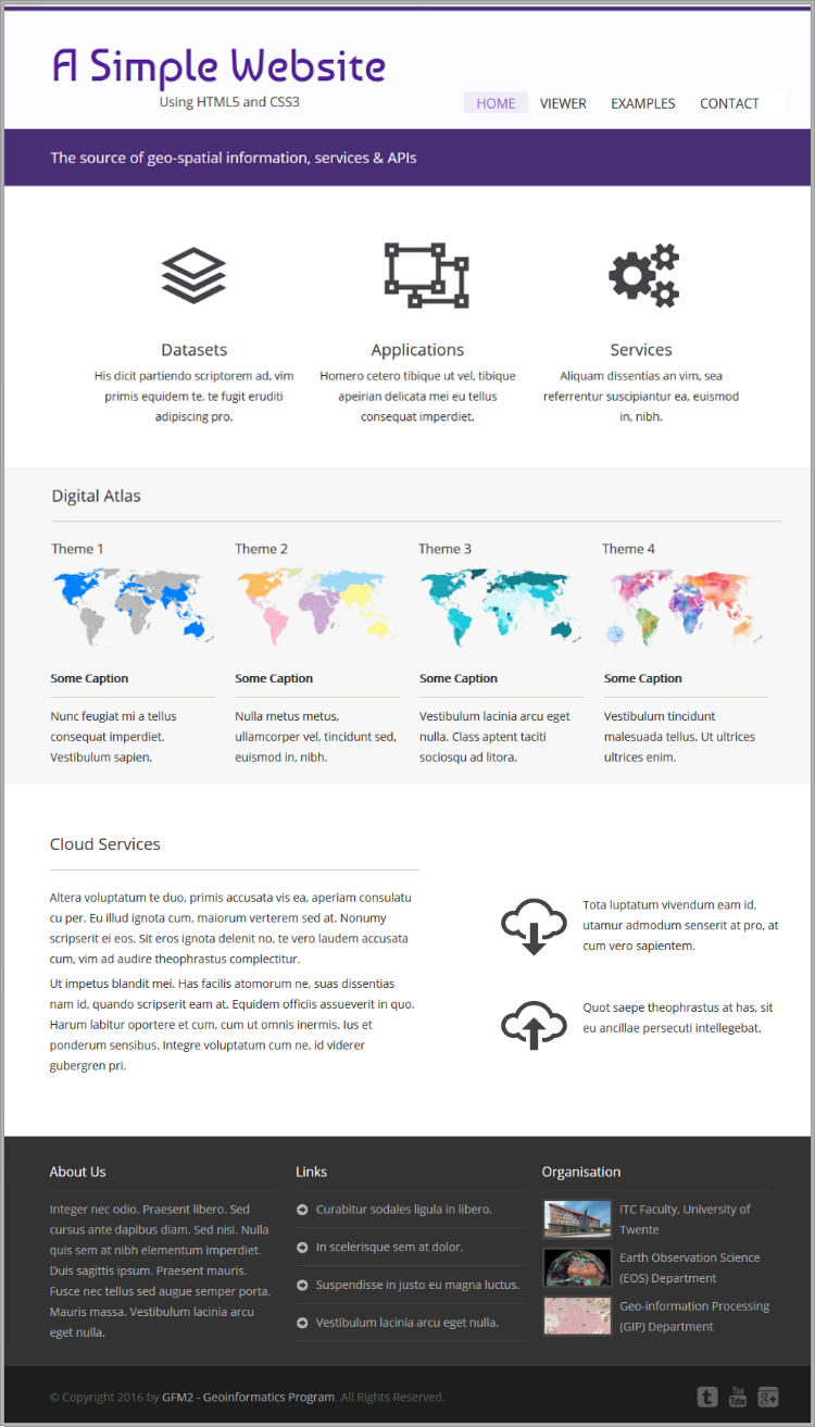
We have now completed the structuring and styling of the Landing Page for the company Web site. Reload the page to see the final result. Figure 14 shows an image of the expected result.
In the next exercise we will focus our attention to the Data Viewer page. It is now time to present the product to our clients, the spatial data provision company.