GIS and Arcmap
Data View in ArcMap
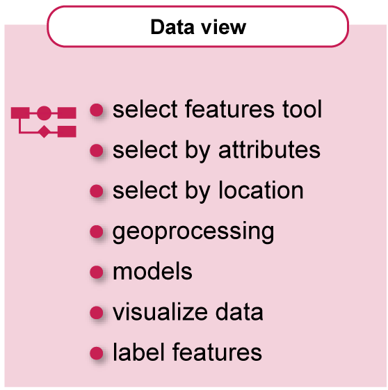
In Arcmap, the environment for displaying, editing, analyzing, selecting, processing .... data is the "data view" window.
In this overview you will learn how to:
- check the attributes
- query the data
- edit the data
- process the data
- visualize the data
Select Data
GIS datasets often are a complex collection of data, containing more data than you actually need for a project. It may be for example, that you only require data showing precipitation in a certain time-frame, or maybe you want to select buildings within a range of 50 meters distance of a road. Data selection in ArcMap can be done in many ways, in this introduction three of them will be explained.
Select data by using the "Select Feature" tool The "Select Feature" tool is located on the Toolbar menu, and offers an interactive selection method. It is important to have the selectable layer checked in the listing options, otherwise multiple unwanted layers may be selected.
The task is to select some feature-points from the “Special_buildings” layer. The “Select Features” tool offers a number of different tools, try them all.
The “Select by Rectangle” tool selects all features that are in the drawn rectangle. Not only the point-features are selected from the “Special_buildings” layer, but also the features of the other layers. Only the “Special_buildings” layer has to be set to selectable. This can be done in the “List By Selection” view of the “Table Of Contents”.
Set the “Neighbourhoods” and “Main_roads” layers to “Not Selectable” and use the “Select by Rectangle” tool once more, now only the point-features are selected.
When using the “Select by Polygon” tool, give a “double-click” at the end to close the selection polygon. All other selection tools respond after “mouse-release”.
Select by attributes Selecting data interactively will not give you the option to select data on a specific attribute or rule. Each of the layers can be viewed also as a table, where the attributes can be studied. In the video "Select by attributes" the selection of "post offices" from "Special_buildings" layer is demonstrated.
The first method is selecting the “post-offices” manually in the “Attribute Table”. Via the “Contextual menu / Open Attribute Table” this selection can be done in the table-field “type”. By keeping the [ctrl] button (on Windows os) pressed, the features can be selected from the table, in the map the selected features are highlighted. When having only a few features this method is fine, but when having hundreds or thousands of features to be selected, it is much better to select the features by using a query.
This can be done from two locations, triggering the same query environment. First location is via the “Table Options / Select By Attributes…” menu, which will open the “Select by Attributes” window. The required “Method” can be selected, after which the Query can be entered in the lower input field. The Query Expression in ArcMap use SQL. By “double-click” on one of the given options in the “Field list” and in the “Attributes list” the required option can be selected. By pressing [Apply] the Query is executed and the selection is shown in the map.
The other location to open the same Query window is via the “Main menu / Selection / Select By Attributes”.
Select by location A third way of selecting data is the relation of that data to another dataset or to a specific location. In the video "Select by location" the selection of buildings within a distance of 50 meter from a main road will be demonstrated.
The tool can be opened via “Main menu / Selection / Select By Location…”. This will open the “Select By Location” window.
The “Selection method” gives four different options: Select features from; add selected features to; remove selected features from; select from current selection. The first method “select features from” is used in this case.
The “Target layer” is the “Special_buildings” layer, these are the candidates of the selection.
The “Source layer” is the “Main_roads” layer, the origin of the selection.
The “Spatial selection method…” gives answers to the questions related to “What is at….?”. For the answer on our question we need to select the option “are within a distance of the source layer feature”. The distance can be entered as well as the unit of measurement.
After clicking the [OK] button, the query is executed, and the result is displayed in the map. The buildings that fulfill the requirement are highlighted in the map as well as in the “Table”.
Edit Data
Data is frequently not 100% presented in the way you need it. The requirements for data in a specific project may differ from the actual data that you have available. Data may miss some attributes or not all of them are complete. Before data can be used in further processing, some editing needs to be done. In ArcMap you can edit several kinds of data. In the following presentation you will be introduced to the editor and the procedure to edit attributes and map features.
To know the location of the ITC building, a guide map is required. The [Add Data / Add Basemap…] menu gives access to a selection of base maps. The “World Street Map” map is selected to identify the location of the “ITC” building. The “Basemap” is placed at lowest level and is therefore covered by the “Neighbourhoods” layer, this has to be set to “invisible” first. When zooming-in it is striking that the “Main_roads” layer does not fit to the base map, there is a shift of approximately 150 meters North and 30 meters East. This error has to be corrected by performing a “datum transformation”, which makes the datasets fit to each other.
The geographic datum transformation cannot be automatically applied because geographic transformations use different methods, with different accuracies, and are defined for particular areas. The datum transformation is applied to the data frame.
Locate the ITC building and initiate editing by selecting [Editor / Start Editing] menu which will bring forward the “Start Editing” window, select the “Special_buildings” layer in this window and [OK].
In the Editor menu select [Editor / Editing Windows / Attributes] option, showing the “Attributes” window. When activating a point, the attributes are displayed in there and can also be edited.
In the Editor menu select [Editor / Editing Windows / Add Features] option, showing the “Create Features” window. The appropriate template for this “Special_buildings” point layer has to be selected, showing the available “Construction Tools”. After selecting the proper tool, the location of the ITC building can be added on the map and the attribute can be entered in the “Attributes” window.
Do not forget to save your work at regular basis.
Processing Data, using the toolbox
Geoprocessing is for everyone that uses ArcGIS. Whether you're a new or advanced user, geoprocessing is likely an essential part of your day-to-day work with ArcGIS. The fundamental purpose of geoprocessing is to provide tools and a framework for performing analysis and managing your geographic data. The modeling and analysis capabilities geoprocessing provides make ArcGIS a complete geographic information system.
Geoprocessing provides a large suite of tools for performing GIS tasks that range from simple buffers and polygon overlays to complex regression analysis and image classification. The kinds of tasks to be automated can be mundane—for example, to move data from one format to another. Or the tasks can be quite creative, using a sequence of operations to model and analyze complex spatial relationships—for example, calculating optimum paths through a transportation network, predicting the path of wildfire, analyzing and finding patterns in crime locations, predicting which areas are prone to landslides, or predicting flooding effects of a storm event.[https://desktop.arcgis.com/en/arcmap/latest/analyze/main/what-is-geoprocessing.htm]
In the video "Processing data, using the toolbox" a buffer of 200 meters for the roads will be produced using a geoprocessing tool from the toolbox. You will learn how to "find" a specific tool in the toolbox and how to use it. The output of the "buffering" operation will be a new dataset, which will be saved in the Geodabase. We encourage you to further explore the tools.
There are more ways to get access to the same tool. Mostly the [Arc Toolbox] will be the used entry, the tools are also accessible through the “Catalog” tab. The “Arc Toolbox” however contains that many tools that it often is hard to locate the required one.
The [Search / Tools] menu will be of a great help in finding the required tool. Type the name of the required processing tool in the input field, in this case a list of possible buffer tools will show. Select the appropriate buffer tool and the “Buffer” window pops-up.
In the “Buffer” window, select the “Main_roads” layer as the “Input Feature”, automatically location and name of the result will be given in the “Output Feature Class”. The location is, as we identified when preparing the project, the “tutorial.gdb”.
The “Linear Unit” has to be set to 200 meters, examine the effect of the other options on the output. After executing the process, the newly created buffer is a is added to the “tutorial.gdb”. and it is added as a layer to the map.
Chaining processes, work with models
Models are workflows that string together sequences of geoprocessing tools, providing the output of one tool to another tool as input.[https://desktop.arcgis.com/en/arcmap/latest/analyze/modelbuilder/what-is-modelbuilder.htm]
Most of the time the analysis or data processing uses a sequence of geoprocessing tools. A tool can only perform one specific task, and more different tasks have to be performed mostly when analysing data. The output result of one process will serve as the input for the next process.
In the video "Chaining processes, work with models" the buffer of 200 meters, created before, will be deleted from the neighbourhood polygon. For further analysis of the neighbourhoods, the area within a range of 200 meters has to be excluded. You will learn how to create your own toolbox; how to start a new model and how to build the model and execute it. For a good understanding of this process, the buffer of the roads will also be processed in the model.
A buffer of 200 meters on the “Main_roads” is created and this will be erased from the “Neighbourhoods”. This process creates two new datasets: “Main_roads_buffer” and Neighbourhoods_erase”. Both can be seen as intermediate products, and should not populate the final database, this should only get the final correct datasets. To manage the different datasets a second “Scratch” GeodataBase can be added to our data-folder. In the menu [Geoprocessing / Environments…] the scratch database can be linked, making that all output processed by the tools is saved in that scratch location.
For creating models, a toolbox has to be created, for this demo it is created in the data folder. Inside the toolbox a new “Model” is created. The symbolization of the toolbox can be changed to match the style used in the organization, here “Style 2” is used.
For this model two input layers are required: “Main_roads” and “Neighbourhoods”, they can be dragged from the Table Of Contents to the “Model” window. For the buffering of the roads the “Buffer” tool is needed, this can be dragged from the “Toolbox” to the model window too, positioning it next to the road. The “Connect” tool in the “Model” window is used to connect the roads layer to the buffer tool. By double-click on the “Buffer” tool the “Buffer” window pops up and the missing information as Linear unit can now be added.
The result of the buffer process is input for the erase process. Drag the “Erase” tool from the toolbox next to the “Main_roads_Buffer” and the “Neighbourhoods”, link both inputs to the “Erase” process.
Final steps are validation of the model and running the model. The output is saved in the “Scratch” Geodatabase, and the “Neigbourhood_Erase” result can be placed on the map.
Visualize Data
When new data is added to the map, ArcMap picks a default style for the element loaded. For point features a point symbol is allocated; for line features, colour and thickness for that line are randomly selected and for polygon features, a colour for the area is selected and a grey line is allocated to the outline of the polygon. These styles are used only to display the data on the map. It is your task to assign styles to the data displayed in such a way that the reader understands what is displayed. ArcMap has many pre-created styles available that can be used to visualize your data. You can also design your own styles.
In the video "Visualize data" three layers are given symbolization, these contain area, line and point features. The example is only meant as an introduction to the Symbology environment and does not give you "best choice".
Best approach for visualizing data, is to start with the bottom layer and then work upwards. Before starting applying symbology, first check the “Attributes table” of the layers to know the values to be used. In this example the “Neighbourhood” layer is done first, goal is to show the population density in three different classes: high; medium; low. The values are in the value field “Density”.
Open the “Properties” of the “Neighbourhood” layer and in the “Layer Properties” window, activate the tab [Symbology]. In “Show” options, select “Unique values” and for the “Value Field” select “Density” as value, activate by [Add All Values]. The colour choice for the symbols is random, these have to be changed by selecting an appropriate “Color Ramp”, the choice depends on the correct implementation of the rules for visualization. At the end accept all settings, click [OK].
Next layer to apply symbology to is “Main_roads”, there is no sub-classification. Follow a similar procedure as for the area layer, open the “Properties” window of this layer. Since the features are of a different nature, the options offered for the symbols will also be different. Clicking on the “Symbol” icon opens the “Symbol Selector, select an appropriate symbol from the many options offered; the choice in this demo is the double-casing “Freeway” symbol. The symbol can be changed to own design, by activating [Edit Symbol…] leading to the “Symbol Property Editor”. Notice that the “Freeway” symbol is constructed and has two layers, a black thicker line at the bottom and a thinner red line on top. Activating a layer gives access to the “Properties” of it, activating e.g. the colour-box opens the “Color Selector”. Apply changes according the design and accept all settings.
Symbolization of the features is done for a specific scale, in this demo the scale is set to 1:40,000. When zooming-in, the road should also visually show wider then when zooming-out. This can be achieved by changing the “Reference Scale” in the “Data Frame / General” properties, add “40000” as value in the “Reference Scale” input-box”, this makes that symbols show correctly.
When zooming-in it shows that the road-junctions do not show neatly, the outlines and infills should join, now they overlap. To correct this, open the “Layer Properties” of this layer, open the [Advanced / Symbol Levels…] options, check the box at the top and accept all changes. The junctions are visualized in a correct way.
The point-features of the “Special_buildings” layer is last in line to visualize, the attribute value “type” shows different building classes. Open the “Layer Properties” window of this layer, select the option [Show / Categories / Unique Values] and select the “type” option in the “Value Field” drop down menu. As example the “school” symbol is edited; click on the point symbol in front which opens the “Symbol Selector”, the styles shown are now related to the point-features. Follow a similar approach as is done for the line-feature, select a base-shape from the styles library and edit the selected symbol to adapt it according design. Accept all changes, do not forget to save your file.
Label Features
In the video "Label features" the point symbols will be labelled.
The attribute table shows that the value field “Name” contains the values we need for labeling these features.
By opening the contextual menu of the “Neighbourhoods” layer, the option “Label Features” can be selected, labels are added in the map but not the correct ones. Open the “Layer Properties” window of the “Neighbourhoods” layer and select the [Labels] tab. In the “Label Field” pull-down menu, select “Name”, leave all other options as they are and accept the changed setting. Labels are shown but overshoot their own area. In this example, only for the purpose of showing a placement option, the option to show only labels in a polygon will be checked. In the “Layer Properties” activate [Placement Properties… / Placement], check the box in front of “Only place label inside polygon” and select in the “Duplicate Labels” the “Remove duplicate labels” option. Accept all settings, the overshooting labels are not placed. There are many ways to influence labeling, refer for more information on this topic to the ArcMap help pages.
Adding additional data-frames
For mapping projects, the final output often involves more than one map. The most common example is the "location map", this is a separate map that shows the position of the study area in the country or the region.
By default, the name of a data frame is “Untitled”, better is to give it a name related to the content. Renaming the data frame is simple, click on the data frame name in the “Table Of Contents” and give another name, in this case the name of the city is given: “Enschede”.
Select from the main menu [Insert / Data frame / Insert Data Frame], rename the “New Data frame” to “Netherlands” which will be the content of that data frame. The active data frame is indicated with bold text, a data frame can be activated by opening the contextual menu of a data frame and select the option “Activate”.
Data can be added, processed and edited in the active frame. In the next four minutes data for the Netherlands will be added and visualized. The steps are showing a repetition of some earlier demonstrated steps, and will not be further commented.
Continue to the layout environment
Most of the common operations are demonstrated in the videos above, in the next chapter the basic layout principles and operations are shown.